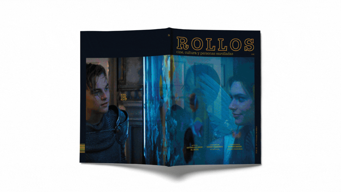
ROLLOS MAGAZINE
EDITORIAL PROJECT
Rollos is an editorial magazine that blends film, celebrity, and pop culture from an unconventional perspective. The first issue revolves around the theme of water, exploring its symbolic, aesthetic, and narrative presence in audiovisual media.
With an expressive visual approach and a distinctive graphic design, each article offers a creative journey that goes beyond informational content.
Own editorial design, concept, and creative direction.
Images used for educational purposes.
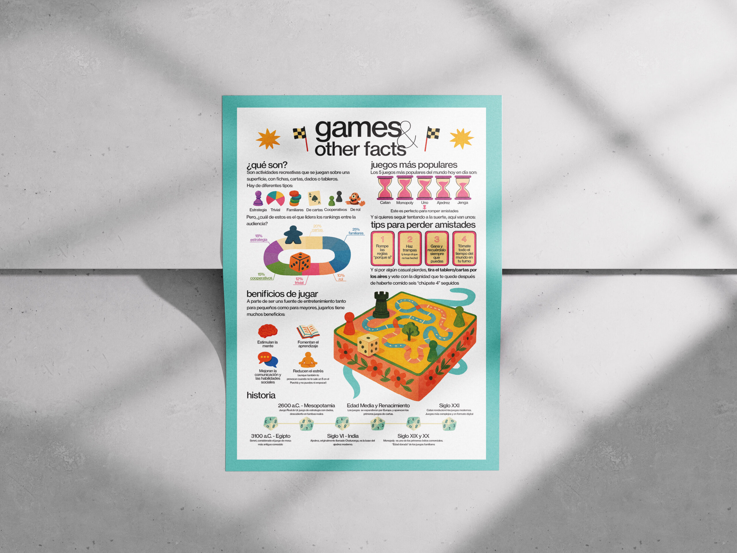
INFOGRAPHIC ON BOARD GAMES
This illustrated infographic explores the world of board games from an informative and fun perspective. Through graphics, data, and striking visuals, it presents the most common types of games, the most popular titles, the benefits of playing, a brief historical timeline, and even tips for «losing friends.»
The design seeks to balance the educational with the humorous, using a colorful, accessible aesthetic with editorial touches. Each section combines text and graphics in a clear and visually appealing way, designed for all audiences.
Own concept, illustrations, and graphic design
EXPECTATION AND LAUNCH CAMPAIGN FOR SPECIAL K
A graphic campaign designed for the relaunch of Special K with a fresh, visual, and conceptual approach. The proposal revolves around redefining the idea of well-being, moving away from stereotypes and opting for a more contemporary, empathetic, and visually compelling language.
The graphic identity blends editorial elements with advertising resources, carefully crafting the composition and tone of each piece. The campaign includes pieces for social media, outdoor advertising, and conceptual packaging, maintaining aesthetic and message coherence.
In-house art direction, concept, writing, product photography and graphic design.


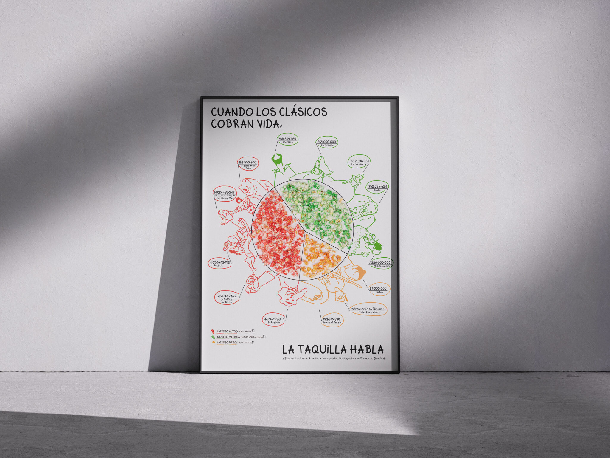
Infographic on Disney Live-Action Films
This infographic analyzes the commercial impact of live-action versions of classic Disney films, comparing their box office take by revenue range. Using colored popcorn as the central visual, three categories of financial success (high, medium, and low) are represented with a playful and visually striking approach.
Illustrated characters surround the pie chart, connecting each film with its box office performance, to ask: Does reviving a classic guarantee the same success?
Editorial design, illustration, and graphic conceptualization by the author along with another colleague.
Brand Manual
Visual Identity for a Photography Shop
Complete development of a visual identity for a photography shop, focusing on conveying professionalism, closeness, and a polished aesthetic. The manual covers everything from the creation of the logo to the typographic system, color palette, graphic applications, and communicative tone.
The design seeks to balance the technical with the emotional, reflecting the essence of the photography industry: capturing moments with style and precision. The identity is versatile and coherent, designed to adapt to digital, print, and physical media.
In-house concept, graphic design, and brand development.

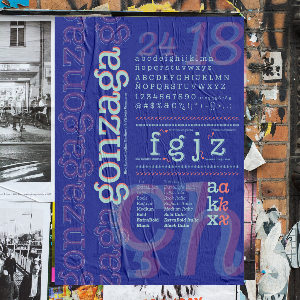
Design and Typeface Specimen
Design of a typeface family with a strong editorial character, designed for titles with personality and legible body text. The specimen highlights its contrasts, irregular shapes, and open lower case, characteristics that give it dynamism and uniqueness.
The poster includes all weight and style variations—from Thin to Black in Roman and italics—as well as construction details, special characters, and typeface combinations.
In-house design, editorial layout, and art direction.